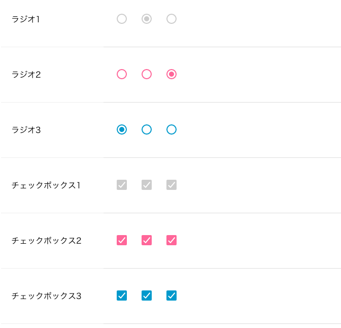
cssでチェックボックスとラジオボタンを簡単に色をつける方法をメモします。本来のアピアランスのままではできないので:before、:afterの疑似要素を使用して色を変えます。
htmlとcss
ではそれぞれのソースコードをみてみます。
html
<label><input type="radio" name="category" class="cl-bt" value="個人"> 個人</label>   <label><input type="radio" name="category" class="cl-bt" value="法人"> 法人</label>
classにcl-btを記述します。
css
input[type=checkbox],input[type=radio] {
-webkit-appearance: none;
-moz-appearance: none;
-ms-appearance: none;
-o-appearance: none;
appearance: none;
position: relative;
right: 0;
bottom: 0;
left: 0;
height: 20px;
width: 20px;
vertical-align: -0.8rem;
transition:all .15s ease-out 0s;
color: #fff;
cursor: pointer;
display: inline-block;
margin: .4rem;
outline: none;
border-radius: 10%;
}
/* Checkbox */
input[type=checkbox]:before,input[type=checkbox]:after {
position: absolute;
content: "";
background: #fff;
transition: all .2s ease-in-out;
}
input[type=checkbox]:before {
left: 2px;
top: 6px;
width: 0;
height: 2px;
transform: rotate(45deg);
-webkit-transform: rotate(45deg);
-moz-transform: rotate(45deg);
-ms-transform: rotate(45deg);
-o-transform: rotate(45deg);
}
input[type=checkbox]:after {
right: 9px;
bottom: 3px;
width: 2px;
height: 0;
transform: rotate(40deg);
-webkit-transform: rotate(40deg);
-moz-transform: rotate(40deg);
-ms-transform: rotate(40deg);
-o-transform: rotate(40deg);
transition-delay: .2s;
}
input[type=checkbox]:checked:before {
left: 1px;
top: 10px;
width: 6px;
height: 2px;
}
input[type=checkbox]:checked:after {
right: 5px;
bottom: 1px;
width: 2px;
height: 14px;
}
input[type=checkbox]:indeterminate:before,input[type=checkbox]:indeterminate:after {
width: 7px;
height: 2px;
transform: rotate(0);
-webkit-transform: rotate(0);
-moz-transform: rotate(0);
-ms-transform: rotate(0);
-o-transform: rotate(0);
}
input[type=checkbox]:indeterminate:before {
left: 1px;
top: 7px;
}
input[type=checkbox]:indeterminate:after {
right: 1px;
bottom: 7px;
}
/* Radio */
input[type=radio] {
border-radius: 50%;
}
input[type=radio]:checked:before {
transform: scale(1);
}
input[type=radio]:before {
content: "";
display: block;
width: 10px;
height: 10px;
border-radius: 50%;
margin: 3px;
transform: scale(0);
transition: all ease-out 250ms;
}
input[type=checkbox].cl-bt,input[type=radio].cl-bt {
border: 2px solid #ccc;
}
input[type=checkbox].cl-bt:checked,input[type=checkbox].cl-bt:indeterminate,input[type=radio].cl-bt:checked:before {
background: #ccc;
}
一旦アピアランスを削除して、:before、:afterの疑似要素で新たにデザインしています。.cl-btで色を設定しています。
これくらいシンプルだと使いやすいですね。